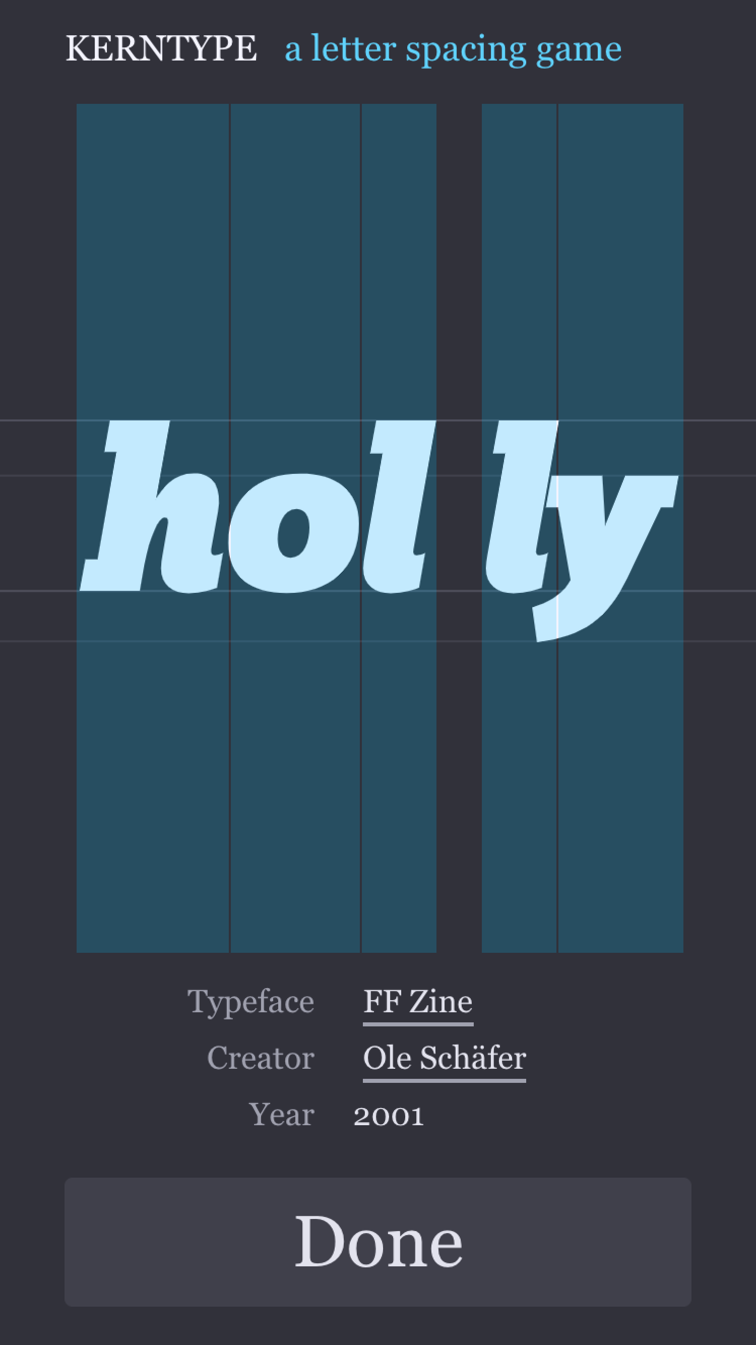
I just dedicated three hours to the New Kerning Game. René wrote an email this morning: “I liked what I saw, but here are some suggestions…” I was about to protest because this is the earliest of earliest stages (pre-alpha, I would call it) but then I saw one of the suggestions was to bring back the guidelines of the original game. It’s this…
![]()
Vs this.
![]()
Hmmm I like it clean, but the lines certainly support the feeling that you move the letters horizontally, and it gives a certain comfort. It is also closer to the original game, which is one of the goals. I know that in future collections I do not necessarily want these lines, so I need a way to optionally add them, per stage.
So what I did was implement something very similar to the Boolean Game: each stage has callbacks which allow me to modify the stage or perform any operation when a stage is loaded or unloaded. In this way I can add the lines and also clear them when you are done playing a stage.
Once this was done I worked on the mobile version. After adjusting the layout and adding mobile specific code, it was working quite well! It is now playable on mobile phones.
Check it out if you’re reading this from mobile https://method.ac/type/
But still, it’s kind of awkward. Your finger obstructs you seeing the letters when you drag them, so an indirect way of manipulating the letters must be provided. My first intention (the quick one) is to make the hit area of the letters as tall as possible, and possibly distribute the available spacing as draggable areas.

I will see how this works. In the meantime, if you happen to come across a good pattern to solve this, let me know at mark@method.ac.