Are developers better at predicting design outcomes?
A week ago I set out an experiment with the hypothesis that designers and developers (or any other profession, for that matter) are equally competent at predicting the comprehension of symbols. Wayfinding symbols are the real world equivalent to icons in user interfaces, and since there is much more research done on wayfinding, I used it to demonstrate my hypothesis.
The research comes from a long defunct German site (2007) called get2testing, which is available thanks to the Internet Web Archive. The author compiled the results from various peer reviewed studies from academic journals and standards organizations.
I don't want to ruin the experiment for you, so if you want to find out the results of the study, complete the test and the answer will be displayed. Your results won't count towards the total, but it's a fun as a game.
1. Choose the most comprehensible symbol for first aid


The key to finding the best performing symbols is to understand what it can be confused with. In this case, the red cross seems to be the most intuitive answer. It's an internationally recognized symbol for medical help. However, when tested in context, users would often assume it meant hospital instead of first aid. Versions with hands performed significantly better.
Studies cited
- Brugger: Ch. (1978): Bericht über die Auswertung des Erkennungstests von November/Dezember 1977. Report to the Austrian Standards Institute (ON) dated 6. 3. 1978, Vienna.
- Brugger: Ch. (1979): Abschlußbericht über den Erkennungstest. Report to the Austrian Standards Institute (ON) dated 09/79, Vienna.
- Brugger: Ch. (1987): Evaluation of Public Information Symbols, ISO 1986 Test Series: Comprehension/Recognition Test. Vienna: ISO / TC 145 / SC 1.
2. Choose the most comprehensible symbol for elevator


![]() Arrows in wayfinding are almost always used directional arrows (ahead, left, right), so when they're used like this it seems to say "tunnel ahead and back"
Arrows in wayfinding are almost always used directional arrows (ahead, left, right), so when they're used like this it seems to say "tunnel ahead and back"
![]() When male and female figures were used in elevator symbols, they would often be confused with washrooms"
When male and female figures were used in elevator symbols, they would often be confused with washrooms"
Studies cited
- Brugger: Ch. (2000): Verständlichkeitstest ON 2000. Report to the Austrian Standards Institute, Vienna, November 2000.
- Easterby, R.S. & Graydon, I.R. (1981): Evaluation of Public Information Symbols: ISO Test: 1979/80 Series. Part I: Appropriateness Ranking Tests. AP Report 99, Applied Psychology Department, University of Aston in Birmingham, January 1981.
- Easterby, R.S. & Graydon, I.R. (1981): Evaluation of Public Information Symbols: ISO 1979/80 Test Series. Part II: Comprehension/Recognition Tests. AP Report 100, Applied Psychology Department, University of Aston in Birmingham, January 1981.
- Freedman, M. (1978): Symbol Signs - The Testing of Passenger/Pedestrian Oriented Symbols for Use in Transportation Related Facilities. Washington, D.C.: Department of Transportation, DOT-OS-60071, December 1978.
- Mackett-Stout, J. & Dewar, R.L. (1981): Evaluation of Public Information Signs. Human Factors, 1981, 23, 139-151.
- Brugger: Ch. (1978): Bericht über die Auswertung des Erkennungstests von November/Dezember 1977. Report to the Austrian Standards Institute (ON) dated 6. 3. 1978, Vienna.
- Brugger: Ch. (1979): Abschlußbericht über den Erkennungstest. Report to the Austrian Standards Institute (ON) dated 09/79, Vienna.
- Brugger: Ch. (1987): Evaluation of Public Information Symbols, ISO 1986 Test Series: Comprehension/Recognition Test. Vienna: ISO / TC 145 / SC 1.
3. Choose the most comprehensible symbol for stairs


![]() This symbol might seem straightforward and simple, but imagine the following scenario: you just entered a building and you're looking for the stairs to reach the underground parking lot. You find this symbol. Makes you think twice, right? The version with two figures eliminates this ambiguity.
This symbol might seem straightforward and simple, but imagine the following scenario: you just entered a building and you're looking for the stairs to reach the underground parking lot. You find this symbol. Makes you think twice, right? The version with two figures eliminates this ambiguity.
Studies cited
- Easterby, R.S. & Zwaga, H.J.G. (1976): Evaluation of Public Information Symbols, ISO Tests: 1975 Series. AP Report 60, Department of Applied Psychology, University of Aston, Birmingham, March 1976.
4. Choose the most comprehensible symbol for fire extinguisher


When flames where added the comprehension of this symbol increased substantially. The "old style" fire extinguisher illustrates the danger of hanging too long to legacy representations (such as the floppy disk for "save").
Studies cited
- Brugger: Ch. (1999): Verständnisschätzungen - Projekt 1999. Report to the Austrian Standards Institute dated December 1999.
- Easterby, R.S. & Graydon, I.R. (1981): Evaluation of Public Information Symbols: ISO Test: 1979/80 Series. Part I: Appropriateness Ranking Tests. AP Report 99, Applied Psychology Department, University of Aston in Birmingham, January 1981.
- Easterby, R.S. & Graydon, I.R. (1981): Evaluation of Public Information Symbols: ISO 1979/80 Test Series. Part II: Comprehension/Recognition Tests. AP Report 100, Applied Psychology Department, University of Aston in Birmingham, January 1981.
5. Choose the most comprehensible symbol for theater


Not everyone shares the same cultural background. The curtain version reached 81% correct comprehension, while the best mask based variant reached 68%
Studies cited
- Brugger, Ch. (1977): Abschlußbericht über den Erkennungstest. Report to the Austrian Standards Institute, Vienna, 1977-10-04.
- Brugger, Ch. (1979): Abschlußbericht über den Reihungstest für die Referents Theater, Kurmittelhaus, Sauna und Fahrradverleih. Report to the Austrian Standards Institute, Vienna, 1979-08-13.
- Brugger, Ch. (1979): Abschlußbericht über den Erkennungstest. Report to the Austrian Standards Institute, Vienna, 1979-09-06.
6. Choose the most comprehensible symbol for tickets


![]() When you display only one ticket a frequent problem is that users confuse it with "show your ticket here", instead of "purchase your tickets here".
When you display only one ticket a frequent problem is that users confuse it with "show your ticket here", instead of "purchase your tickets here".
![]() This variant was often confused with "money exchange"
This variant was often confused with "money exchange"
![]() This pictogram has two recommended applications, and this one is for "ticket desk" or "ticket office".
This pictogram has two recommended applications, and this one is for "ticket desk" or "ticket office".
![]() This is the recommended option for "ticket booth".
This is the recommended option for "ticket booth".
Studies cited
- Brugger, Ch. (1980): Abschlußbericht über den Erkennungstest für den FNA 178 "Seilförderanlagen- und Pistenleitsysteme". Report to the Austrian Standards Institute (ON) dated 22.2.1980, Vienna.
- Brugger, Ch. (1983): Abschlußbericht über den Erkennungstest. Report to the Austrian Standards Institute (ON) dated May 1983, Vienna.
- Brugger, Ch. (1987): Evaluation of Public Information Symbols, ISO 1986 Test Series: Comprehension/Recognition Test. WIEN: ISO/TC 145/SC 1.
- Brugger, Ch. (1995): Verständnistest 1995 - Im Auftrag der ÖBB und des ON - FNA 133. Vienna, November 1995.
- Easterby, R.S. & Graydon, I.R. (1981): Evaluation of Public Information Symbols: ISO Test: 1979/80 Series. Part I: Appropriateness Ranking Tests. AP Report 99, Applied Psychology Department, University of Aston in Birmingham, January 1981.
- Easterby, R.S. & Graydon, I.R. (1981): Evaluation of Public Information Symbols: ISO 1979/80 Test Series. Part II: Comprehension/Recognition Tests. AP Report 100, Applied Psychology Department, University of Aston in Birmingham, January 1981.
- Freedman, M. (1978): Symbol Signs - The Testing of Passenger/Pedestrian Oriented Symbols for Use in Transportation Related Facilities. Washington, D.C.: Department of Transportation, DOT-OS-60071, December 1978.
Your score:
How it was done
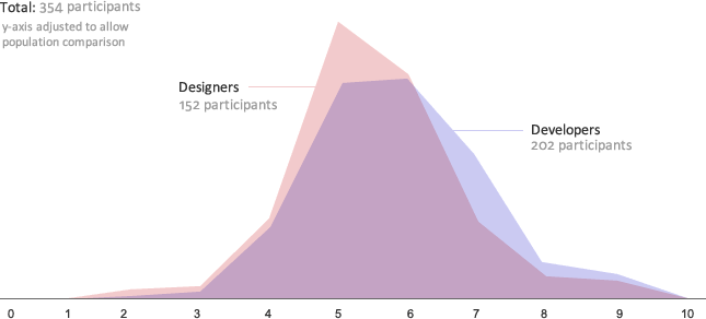
I published the link in Twitter, in the Design Subreddit and I posted it as a promoted link in Forrst. I got a total of 152 responses from designers, 202 from developers, and 39 from other disciplines. I discarded the results from other disciplines, because the population was too small to be usable.
I assigned a score from 0 to 4 to each symbol, depending on the performance it had achieved according to get2testing. Then I added the score and averaged it to a 10 point scale.
Results
As the result trickled in, I was quite surprised to find that developers were edging out designers by an average of 8%. Frankly I'm not sure if this is statistically significant. I expected the results to level out, but as more people responded, the trend only got stronger.
This is how it looks if you graph it out and adjust the scales to be able to compare both populations:
Some thoughts on the results
I was quite surprised at this. If anything, I would have expected designers edging out developers. I think that some designers might have gone with their aesthetic sensibilities, as someone on Reddit pointed out
Some of the wording made me unsure if I was voting correctly. Since it says "most comprehensible symbol", I want to select the icon that best explains the situation assuming no prior knowledge. Meanwhile, as designers, sometimes we make a decision outside of the obvious for aesthetics or in support of certain technologies. I would argue that my choices in this poll were not the most comprehensive symbols, but my preferred symbols.
In essence, developers might have been able to look at the problem without any prior bias and honestly choose what they thought was more understandable.
Method of Action will be a free peer learning website will include a course on design for programmers. If you haven't done so, I'd recommend reading why you're already a pretty good designer or follow us on Twitter.
9 comments
That's interesting! Thanks.
In my human opinion, such little difference between designers and developers puts a big question mark on professional skills of modern designers :) Thanks for such nice research Mark!
In defense of designers (as I am one), being able to judge the efficacy of a particular design is not the same as being able to come up with it in the first place.
As feedback for your own design: I initially did the experiment on the form page. I read this post and was searching for the results, then clicked on one of the images by chance and it revealed the results (problem #1, IMHO). It wasn't until I reached the bottom and saw the pitiful score that I realised you were tracking which image I'd clicked on (problem #2), so I refreshed and chose my original answers to find out my true score.
Thanks for the interesting experiment. :-)
Wait, what about the home gardening?
Very interesting. I could have guessed that though, because developers are smarter than designers :-P. BTW, I'm a developer.
I think it might be an education issue. Most of the questions had (in my mind) "Standard" symbols where the best symbols where improvements over the standard symbols. I think designer may be more in tuned with what is customary or standard iconography for these things and picked them out of recognition. Where as the average developer may not be as attuned to the standard symbology.
Results are not displayed when you finish the test ?
Nice little research here :) I actually dont think its that hard to do a statistical analysis on this data. Both datasets look fairly normally distributed, so you could use this as an approximation by estimating the distributions with maximum likelihood, then do a test for signicance. Also its possible to do a bootstrap simulation, certainly your sample size is large enough :p